


Tempô
Duration
7 weeks
skills
UX/UI Design
UX Research
prototyping
team
Tina Alidaee
Bonnie Chen
Lucy Huang
Rebecca Lu
Cynthia Pan
tools
Figma
protopie
Context
For this self-directed project, we chose to address immigration concerns within Metro Vancouver and how they affected immigrants, which make up 41% of the regional population. Our group was passionate about this topic because of our connections with immigration whether through family or personal.
In our initial ideation session, I proposed to create a better transition during the immigration process by having a family companion in the local area for support—inspired by homestay programs. Finding housing was found to be an opportunity for improvement, so we conducted research local tenancy laws, PR (permanent resident) status requirements post-arrival in Canada, as well as housing platforms. We also held interviews with Vancouver immigrants on their struggles with housing and settling down. I assessed existing platforms with housing options such as Craigslist, AirBnB, and Facebook Marketplace, noting the following:
Many house listings on these platforms appeal through their neighbourhoods and their characteristics. Such niche knowledge may not be known to immigrants when choosing housing.
Non-native English speakers may have difficulty understanding house listings with verbose and lengthy descriptions.
Therefore, our goal for Tempô is to showcase housing options in an easy-to-understand format to new Metro Vancouver immigrants.
App direction
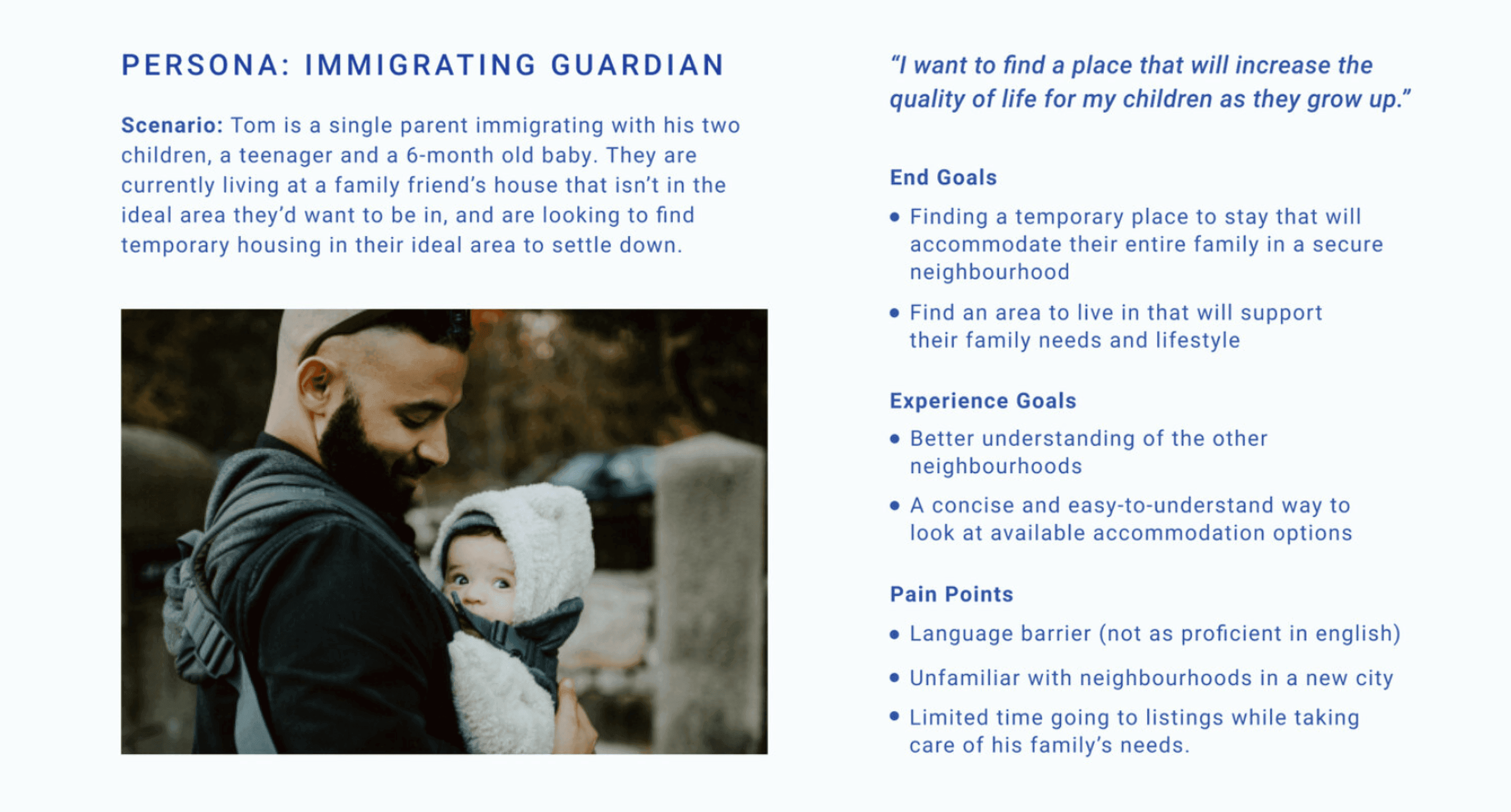
Based on our initial research, we created a persona, Tom. Tom has a busy schedule as a single parent and aims to find housing efficiently.
Our persona Tom allowed us to create a more cohesive vision for Tempo when creating our wireframes.
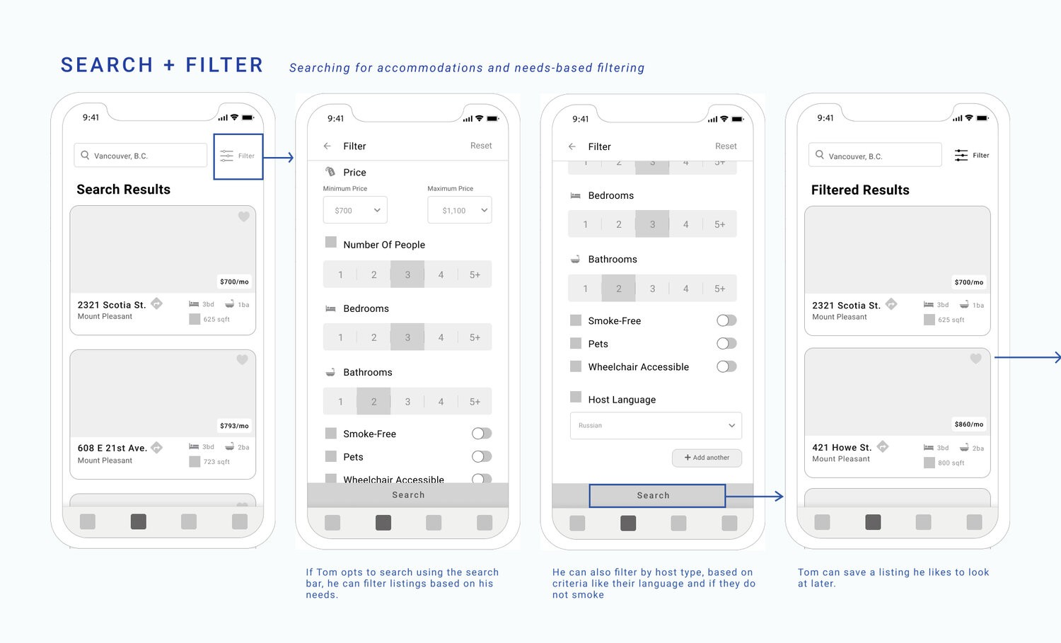
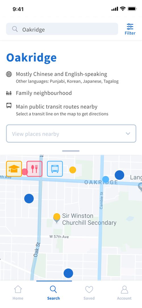
Design critiques from our class presentation showed that there were too many screens within each interaction and that information (particularly, map and neighbourhood exploration) felt overwhelming at first glance which went against the pain points mentioned for Tom and our goals for Tempo.
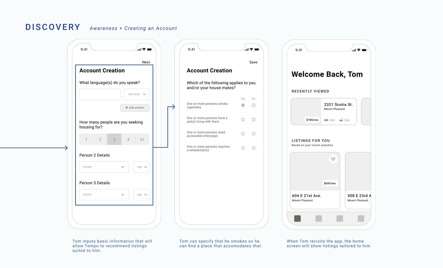
Initially, Tempo was meant to be accessed through government immigration services as seen in the onboarding with QR codes. However, in our final design, we chose to have public access to the app in favour of inclusivity and simplicity for users.
iterations
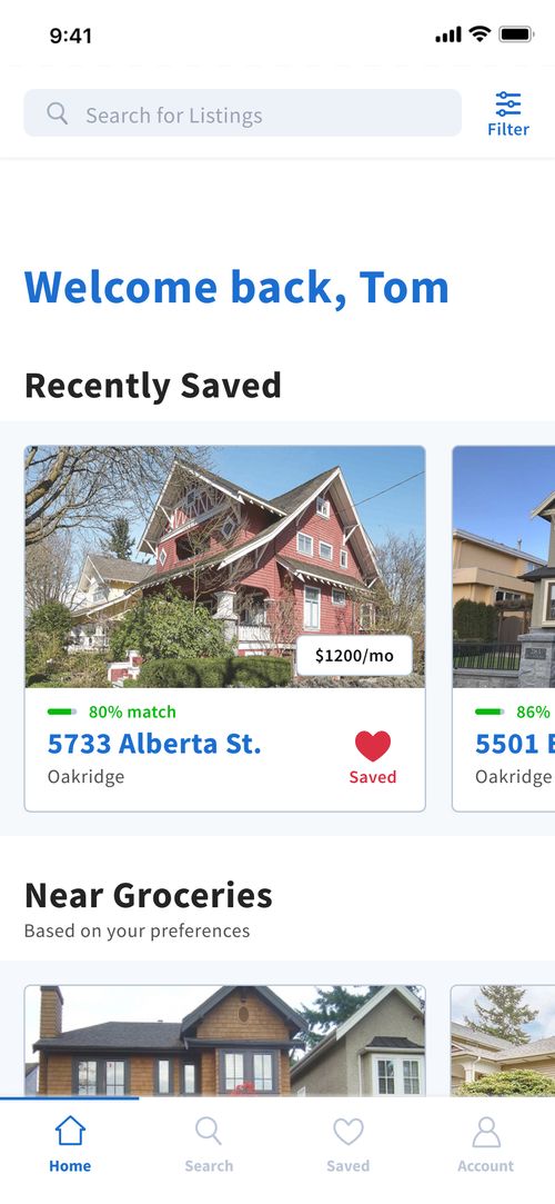
I was the Lead UI Designer and was responsible for creating a style guide and overseeing layouts of main interactions within the mobile app, including maps, and house listing cards (see gallery below, and tap images for notes!). I vouched for an emphasis on imagery in our interface in consideration of potential language barriers.
I also took part in prototyping to create a working version of Tempô in Protopie. Doing so provided clarity on how our end users would navigate the mobile app and how well it functioned.
Our main challenge for Tempô was to convey overwhelming amounts of information in a straightforward and simple manner. One solution I proposed and implemented into the app was icons to represent important features of a rental listing. Although it was not a perfect solution, providing an icon alongside text would potentially help users to visualize what is being conveyed.
results & reflection
Overall, Tempô was well received by our instructors and peers! A comment we received from our teaching assistant is that Tempô is something she would have liked to have when she first moved to Vancouver as an immigrant.
If given more time to improve on our solution, I would conduct A/B testing on the effectiveness between icons versus images for conveying information such as bedrooms, bathrooms, etc. Icons may have different denotations across other cultures and understanding; conducting user studies of how it might affect our target audience compared to using images would lead to better understanding of information from our users.

